Tag Archives: Graffiti

Canvases

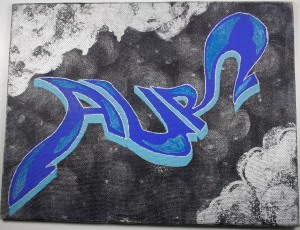
As I haven’t actually posted any of my work so far, I thought I’d post some pictures of some of my canvases. These are all from a few years ago, I’ve been focusing on my graphic design work for awhile, but I’m finally getting back to doing canvas pieces. I also got a pack of On The Run paint markers for Christmas, so I’ve been looking for places to use them. These pieces were done with a combination of aerosol, acrylic, and paint markers, and most of them are pretty small. The series with single letters was meant to be part of an entire alphabet. If I can find the same canvases again I will probably complete it at some point. Unfortunately, some of them were damaged a little while I was transporting them. I will probably be posting more as I unpack my stuff from New York, and as I complete more pieces.

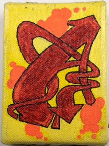
Renata A Piece

3" x 4"

Renata B Piece

3" x 4"


Renata C Piece

3" x 4"

Renata Small Aur Piece

“Aur” 2″ x 3″
Renata Aur Piece

"Aur" 9" x 7"


Handselecta and Graffiti typefaces

Joker Medium Swash typeface

Joker Medium Swash Caps B from Handselecta

Handselecta is a type foundry that turns graffiti handstyles into typefaces. The founders both have backgrounds in graffiti and are working with other writers to turn their work into typefaces. They seem to be some of the few people making quality graffiti typefaces, and taking the idea beyond novelty fonts. As they say on the “Thesis” page of the Handselecta website,

Our intent is to intelligently extend the art form of graffiti into the world of typography and graphic design…Just as calligraphy was the inspiration for type designers of generations past, today’s urban glyphs are the inspiration for a new typography of tomorrow.

I’m interested in what others from the type and graffiti communities have to say about past and present “graffiti fonts,” please post a comment if you have any thoughts.

Revs

Revs and Peak

Revs and Peak in Williamsburg, Brooklyn

Revs Sculpture

Metal Sculpture by Revs

I’ve been a fan of Revs’ work for awhile. He started in the 80s and has been an influential figure in the graffiti world. From his roller letters and subway tunnel journal pieces to his graffiti sculptures, his work always stands out. Although I like the variety of styles and media he uses, I think his sculptures are some of his most interesting work. I really like the idea of sculptures as graffiti, as well as the way he has turned the letters of his name into 3D objects.

Fine Art, Typography, and Graffiti

Armogedon 2057 canvas

I recently discovered this artist’s website and found that his goals sound pretty familiar. He is a fine artist whose work is influenced by both graffiti and typography. According to his website:

Armogedon’s work is a collaboration of typographic elements and exploration with the formal structure of graffiti . By looking at graffiti and studying typography’s visual commonalities as lettering, much can be discovered and revealed. As graffiti matures and diversifies, more and more of it’s aesthetics filters into contemporary art. It has gained acceptance in popular culture at large and now comfortably accepted as a contemporary mode of communication. Graffiti has mass appeal due to its illegality and excitement. Typography is omnipresent in today’s PC-based information society. Armogedon is Striving to blur the line of typography and graffiti striving to find relationships between the two forms of communication.

I find Armogedon 2057’s pieces very interesting (in a good way) especially because he seems to be using shapes and colors of a contemporary three-dimensional looking style of graffiti without necessarily using letters. It’s great to see that there are other people out there with similar goals to mine using different approaches.
You can see more of his work on his website: http://www.armo1.com/home.html

iLK

iLK La Surprise

iLK "La Surprise"

This freelance design firm from Paris has done some really interesting work that fuses graffiti and typography. They’ve also worked for some pretty well known clients. Another example of the growing number of artists and designers taking inspiration from both areas. Their website has some nice examples of their work.
http://www.ilkilkilk.com/

Faith 47’s Calligraffiti

Faith 47 "epitaph"

Faith 47 "epitaph"

Wow. I’m blown away by this artist, Faith 47. She’s a writer from South Africa and her work is incredible. I saw this video of her work on Alan Ket’s blog and then looked up her website. She does these amazing calligraphic pieces, as well as paintings and illustrations. I find all of her work pretty interesting, but it’s definitely the lettering that I’m really drawn to. It’s worth checking out for both writers and type fans.

Just Blazed City Art Supply and Gallery

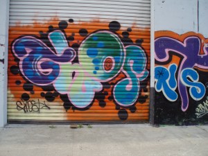
I checked out this graffiti shop on McDowell Rd. in Phoenix on my trip. They had some great supplies and some really nice canvases. There’s also an alley in the back where writers can paint. It’s so great to see a store like this now, there wasn’t much like it when I lived I Phoenix (there was Wet Paint, which I still love). I was really impressed by what they had, and even more impressed by the work in the alley. Here’s a link to their website http://justblazedphx.com/ and some photos from the alley.

Alley Piece 1

Alley Piece 2

Alley Piece 3

AZ Graffiti post 2

McDowell alley piece

Graffiti from sunny Arizona

I finally got out to take some pictures around Phoenix. Seems like the scene out here is a lot more focused on tags than NYC, probably for a few different reasons. I did get a shot of a nice billboard piece/throwup though, and I’ve seen more nice legal pieces around recently. I also visited a graffiti store, which I will talk more about in another post. The picture above is from an alley behind it that’s filled with amazing pieces. It seems like the Arizona graffiti scene has really been improving since I moved to New York.

Tools of the Trade: Drips (Post 1)

Continuing my series on the influence of tools on lettering in graffiti and typography, my first topic is drips. Drips in tags are a really interesting example of the influence of tools in graffiti. While drips are undesirable in pieces or tags done with aerosol, as they show a lack of skill and experience in the use of the paint, they are created on purpose in some marker tags. In this case, they are created by homemade or commercial markers with tips specifically made or altered to put out large amounts of ink. In addition to the popularity of the way drips make a tag look, they also signify (at least historically) that the writer has a large supply of ink.

Drips

NEA and AVONE's drippy tags.

As the drips are created by the random and unpredictable flow of ink on the surface, they are fully a product of the tool. The writer can only control the amount of flow and speed of writing, both of which affect the drip pattern. However, the final result is dependent on the interaction of tool and surface. Although drips do not affect the basic shape of the letterforms in the same way as a broad tipped marker does, they do create a very recognizable overall look that can only be created with certain tools and techniques.

NYC Gates

Ghost Gate

NYC wants to ban security gates that often serve as a canvas for graffiti.

It seems New York City has decided to phase out those metal roll-down security gates, that many stores use at night, by 2026. Apparently the main reason for this is because they attract graffiti. Here’s an article about the decision:
http://cityroom.blogs.nytimes.com/2009/11/30/council-curtails-stores-use-of-rolldown-security-gates/
and one featuring some ideas on how to decorate the gates instead:
http://cityroom.blogs.nytimes.com/2009/12/02/gates-reader-submissions/?emc=eta1